Enabler provide best practice advice around optimising your click-thru rates within email marketing communications for B2B and B2C, from a multi award-winning email agency.

Posts

Unfortunately, not all of your subscribers will engage with the emails you send them. The average office worker receives 121 emails a day, making inboxes a competitive environment for you to be seen. A couple of reasons why some people might not engage or open your emails include; content, frequency/time of sends and your subject lines. A study by Marketing Sherpa found that personalising the subject line can increase open rates by over 17%.


So here are 6 simple ways to try and re-active your less engaged subscribers and stand out from the other 120 emails!


1. Make your emails more relevant

One of the most obvious ways to re-engage your less active contacts is to go back to the basics, remember why your contacts originally subscribed to your mailing list and the communications they would expect to receive from you. Sending irrelevant content which the contact did not originally subscribe to receive could result in contacts unsubscribing or not opening your emails.

2. Define inactive

How would you define your less engaged users? Have a think about who would be classed as your less engaged contacts. For example anyone who has not responded, opened, clicked or acted on any email sent in the past 6-12 months. With this information you can then set up a list of contacts classified as less engaged and target these people with relevant re-engagement campaigns.

Inactivity can be classed differently depending on the industry you are in, for example if you’re running a transactional email campaign based on insurance renewal dates, you may expect less people to interact on a day to day basis, but when approaching the dates relevant to the contact they will be more engaged. This is where personalisation is key, making your campaigns specific and relevant to the data you hold on your contacts. If you work in fashion, you might want to look at seasonal trends to determine inactivity.


There’s a really great school of thoughts around the key ways of defining active / inactive subscribers which split into three:

  • Ghosts: (they were never active, just joined your list once and never opened anything.  The best way to target these people is with a re commitment campaign (e.g. are you still interested) if they’re not, get rid of them!
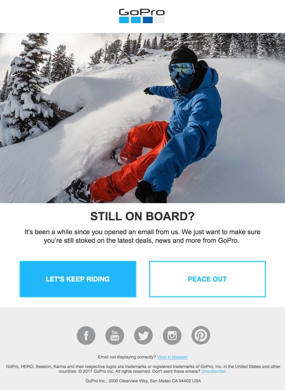
  • Un-engaged (sleepy) – they were once engaged but aren’t any more AND it’s only just happened.  Best way to target these people is with a re-engagement campaign.


  • Zombies – They were once engaged but haven’t interacted with an email in yonks and it’s unlikely they ever will (Zombies may have once been the un-engaged).  Best way to target these people is to ramp down communications slowly e.g. if you were emailing them weekly, go down to monthly, if you were emailing monthly go down to quarterly etc
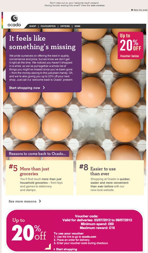
3. Target relevant people

Now you have got your less engaged users defined, you can split them into different groups to ensure they are getting content which is relevant to them. For example you could look at your contacts age, geography, buying behaviour, job title, education or previous open activity. With this information you can go back to point 1 and target these contacts with relevant content based on their demographics.


4. Find out what your contacts want…

…and make sure you’re giving it to them. You can use surveys, polls and forms to find out more information about what content your less-engaged customers would like to receive from you. You could ask them questions about the emails they have received from you in the past and what content they would like to see in the future.

Now would also be a good time to ask your contacts to update their marketing preferences. Ask them how frequently they would like to receive emails and what content they would like to recieve, for example; marketing material, business updates and newsletters.

The key thing here is making sure that you use any learnings you find from asking to influence your strategy going forward.


5. Include CTA’s

It’s important to include call to actions in all of your marketing emails you send out. Giving your contacts the option to get further information and learn more about the content you are sharing with them is vital. Building a reputation that your emails are going to contain exciting, relevant content will increase the chances of your contacts engaging in future communications. Make sure you’re getting the most out of your CTA’s by checking out our blog on Call to Actions!


6. Improve your subject lines

Subject lines are really important and will most likely be one of the main deciders to someone wanting to open your email or not. There are many ways you could improve your subject lines. We already have a really handy blog post with our Top Tips for an Irresistible Subject Line, go check it out.


I hope these 6 tips have given you some ideas to try and re-engage with your less active contacts. Using our email platform, Enabler, you can build great re-engagement emails, forms/surveys and polls and organise your contacts into data lists. If you would like any assistance or if you have any questions, please contact us and we will be happy to help!

Sometimes marketers need to learn when it’s time to let go. There’s nothing wrong with cleansing your data of people who don’t want to hear from you. Inactive subscribers can be a waste of time and resources. What’s the point of focusing efforts on a contact that doesn’t seem interested in your company or product anymore?

A final point to consider, if you are constantly trying to email people who aren’t opening your emails it could have a negative effect on your sending reputation/deliverability. For example if Google or Yahoo sees that you’re sending email after email to people that aren’t opening them, they could start diverting your emails to the spam folder.

It’s all about making smart decisions summarise what you’ve said and wrap up

Email marketing has been and will continue to be one of the most effective marketing tools in a marketeers arsenal. On the face of it, email can look really straightforward, but underneath there are intricacies that make planning a successful email strategy tricky… especially for a first time flier! Given the complicated nature of the email channel, we often get asked if it’s actually worth using the channel at all. As you can imagine, my answer is yes… and here’s five key reasons why.

1 . King of All Marketing Channels

Email marketing works 40 times better at acquiring new customers than Facebook and Twitter, and compared to social media; offering marketeers 17% higher conversion rates.

That’s right. Email rules the roost. Now, I’m not saying you should read this and immediately go and start bombarding your marketing list with emails, but this definitely demonstrates why you should be making efficient use of the channel. Additionally, email is better than Facebook because according to Forrester, people are twice as likely to sign up for your email list as they are to interact with you on Facebook.

2 . Subject Line Influence

47% of people will open an email based on the subject line alone.

Now I was pretty astounded when I found this figure out. In my head, as a marketeer, people would primarily be opening emails based on brand recognition, so to find out subject lines actually have a pretty huge impact, without the branding side playing a role, changed the way I approached my email marketing. What’s really interesting is that 69% of email recipients report email as spam based solely on the subject line, so it’s a careful balancing act.

If you need some help creating magical subject lines, check out our top tips for an irresistible subject line.

3 . Impact on ROI

44% of email recipients made at least one purchase last year based on a promotional email.

If this doesn’t convince you how valuable the email channel is, I might as well give up now! This is why we try and grow marketing lists and target people using personalisation – the benefits it can have are incredible.

I don’t know about you, but in every place I’ve worked, email is the one thing that is constantly questioned. I’ve lost count of the times where I’ve heard ‘Yeah but does it actually do anything’ or ‘Prove it’. This is a clear sign that email is a valuable channel and incredibly effective.

4 . Checking in

89% of Americans check email at least once a day; nearly 21% check their email more than 5 times a day. This is a true testament to how many opportunities there are to not only drive existing and potential customers to buy from brands based on email, but also to increase brand awareness and presence. There is no other marketing function that allows you quite as much exposure to consumers so efficiently.

5 . Useage

According to Radicati’s 2016 Email Statistics report, emails will be used by 3 billion people by 2020. That’s almost half of the world’s population.

Currently, there are over 2.6 billion email users worldwide. This is crazy given how many other forms of communication are available e.g. IM, Social Media. While new communication tools are constantly being developed and released, email is the one outlasting them all. You will also find that email addresses are the main form of identify required for day to day functions such as online shopping and social networks, suggesting that no matter how many new ways of communicating spring up, email will always be necessary and useful.


So there you have it – five key stats about email.

So, you’ve got your awesome email and you know what you want people to do when they receive it, but you could do with something to give them a final push to take action – that’s where landing pages come in!

What is a Landing Page?

In a nutshell, it’s a purpose-built page on your website with dedicated content which can be accessed directly via a link. Because the content for your landing page is usually unique to your marketing campaign, whether it’s a point of entry for a competition, a data capture form or a link to a unique discount code, your landing will normally sit separate from your main website. One big advantage of having a separate landing page for your marketing campaign is this ability to hide it from your main navigation, as it gives you full control over who has access to this exclusive content.

Now, because your landing page is hidden from public view, you need to being actively driving traffic directly to the page to encourage engagement. Whether it’s a link within an email campaign, PPC campaign or social media campaign, you want to ensure whatever channel(s) you choose to drive traffic will maximise exposure and engagement for your well-designed landing page.  The more relevant the landing page content is to your audience, the more likely they are to follow your call-to-actions, thus increasing your conversions. Having a specially-designed page is more likely to be effective than sending them to your main website, where they may struggle to find the promised content.

Additionally, many of our Enabler clients find that having a bespoke landing page is the most efficient way of getting a marketing campaign launched quickly.  It can often take months for changes to be made in-house to company websites due to IT backlogs, so having the ability to create dedicated landing pages yourself within Enabler is far more efficient.


So, what does a “well-designed landing page” look like? Let’s talk guidelines for setup and creation:


What is the Aim of Your Landing Page?

You’ve designed your bespoke landing page, so now the first thing you need to decide is – What is its purpose?

Generally speaking, this falls into one of two categories:

  • Generating leads for future marketing
  • or to encourage click throughs

Data Capture and Lead Generation

This type of landing page is designed with the intention of capturing your audiences’ data.  You could use this type of page to gather new consumer data or to build more detailed profiles of your existing audience base.  Alternatively you can use data capture forms to help you personalise your future marketing campaigns based on the consumer feedback.

A typical data capture landing page includes a form to complete (obviously), and more often than not include an incentive which will encourage people to complete the form and give you their information. This incentive could include exclusive content or offer, such as white papers or discount codes.

“Why would you want to capture more detail about your existing customers”, we hear you ask – well, the more you know about your customers, the better your campaigns can be, and the better your conversions.  So something as simple as “Let us know your birthday so we can spoil you on the day!” is a great way to offer an incentive while gathering valuable data.

Data Capture Landing Page Example:

This is a great example from our friends over at Salesforce – (as we’re a Salesforce partner this might be a little biased, but this really is a great example of an effective, well-designed landing page).

Why do we like this landing page?:

  • Minimal copy, well styled and bullet-pointed list ensures the overall page isn’t cluttered and is easy to skim read.
  • Check out those security badges below the form. It’s never a bad idea to assure potential customers that the data they are about to share with you is safe.  This can often be a massive issue with some standalone landing pages, as it’s very difficult to prove the landing page belongs to the company it’s advertising.
  • Eye catching content. Having that blue background on the data-capture form really makes it stand out, which will help drive engagement.
  • Catchy headline. Having a buzzword like ‘lightening’ makes it sound like it won’t take very long, which again helps to drive engagement.

Landing Pages to Drive Click-Throughs

This sort of landing page designed to encourage clicks often forms part of the e-commerce sales funnel. The page content is likely to be product information to warm the visitor up to the idea of buying the item(s), with a call-to-action click-through that takes the visitor to the purchase point.

Click-Through Landing Page Example:

Now as a general rule I’d always have the models looking at the copy they’re promoting, but this little guys face really sells the whole thing either way. ‘What else is good?’ I hear you ask:

  • Another cracker of a headline here. “Most Trusted” – having a snappy statement like this gives kudos to your brand and builds trust with the consumer.
  • The tick bullet-points makes the benefits clear and easier to understand than having them in a block paragraph.
  • The call-to-action button is clear and stands out (bright yellow will always do that!)
  • Mobile-friendly – The phone number in the top right is a click-to-call, making it super easy for viewers to contact Nationwide.

All in all, great job!

Designing Your Landing Page

Although we’ve mentioned that a landing page usually sits separately from your main site, you ideally want to ensure that it still reflects your branding and styling of your main website/ This way your online presence is consistent, offering visitors a seamless journey that doesn’t feel separate or disjointed from your brand.

It’s also important that visitors experience “message match” – meaning that the content on your landing page should reflect the message content they clicked.

Here’s a great email example that our Enabler designers created for our client Ralph Lauren recently:

Ralph Lauren’s Email:

As you can see, there’s a nice clear call-to-action for recipients ‘explore their gifting lookbook’, and the email content portrays the stylised content of the Ralph Lauren brand. So, what did this email link take you to…?

The Landing Page We Designed:

Anyone clicking the email link is taken to a dedicated landing page, hosted separate from the Ralph Lauren website, where you are greeted with a brief explanation of how the landing page’s ‘lookbook’ works.  The ‘message-match’ of the landing page mirrors the styling of the email perfectly, matching fonts and colours.

After closing the greeting box, visitors get to explore the promised lookbook – an interactive landing page experience:

Fully Interactive Landing Page:

The Ralph Lauren website wasn’t available for this campaign, so our designers had to fashion (see what we did there?) a bespoke landing page hosted separately on our Enabler servers.  This interactive landing page had lots of fun animated elements to make it appealing and engaging, and was a fantastic way to help showcase Ralph Lauren’s products separate from the Ralph Lauren website. This interactive element makes it a really great example of making the most out of your landing page.

Don’t Forget To Track Your Landing Pages

It’s all very well getting people clicking through to your landing page, but all that work is for nothing if they drop off without actually engaging with the landing page content. How will you know if people clicked through but then dropped off? How I hear you ask? Tracking! You can optimise your page using the same tracking you would use on your website (e.g. Google Analytics) to get all of this information.

What Next?

If I’m being completely honest, the best thing for you to do before putting a landing page together is come and speak to our team. We build landing page campaigns for global brands every day, it’s our bread and butter.

If you would prefer to build your own landing page, here’s a quick checklist of things to remember:

  • Keep your messaging consistent
  • Bright, clear CTA’s
  • Don’t overcrowd the messaging
  • Prove it’s a safe and secure site for gathering data
  • Make the benefits of signing up clear
  • Tracking, tracking, tracking

Happy landing paging!

Emojis are everywhere…on social media platforms, blogs, text messages, and now they are even in movies. They are used by almost everyone – even your grandma (once she’s worked out how her smartphone works).  Although you personally might not use them, it is highly likely that someone has sent you an emoji on more than one occasion by now.

One platform where emojis are undoubtedly quite useful is email marketing; especially when your open rates are at stake!

With marketers making every effort to cut through the noise within the inbox and get their message seen by their target audience, emojis come in quite handy.  When used appropriately, these little emojis can be a huge help with increasing open rates.

Before choosing whether to use or ignore them, perhaps have a quick read about our experience with emojis and what we really think of them. There’s no stopping these little guys, with 56 new emojis moving onto your smartphone this autumn, so if you are thinking about using emojis within your email marketing we have some helpful advice…

The best way to really maximise the impact of these little icons and really drive increased engagement is to place them within your subject lines.


Emoji-Style Subject Lines

One excellent example of emojis within your subject lines is when they are used as an extension of your brand. For example, if you are a music company selling gig tickets, you could use a speaker emoji in a subject line:

Another attention grabbing example is the one I from travel agent, as shown below. The company was able to convey the call to action: Book a trip > Get on the plane > Enjoy the sunshine, all through the use of emojis.  With emojis taking up so few characters, they free up valuable space for this tech-savvy travel to convey their CTA hook: a ‘discount’ and sale’.

And here is my favourite one, from a fashion retailer who has taken email personalisation and targeted data to the emoji level. Not only did they send a birthday message, they also included a birthday balloon in the subject line:

Why Use Emoji Subject Lines?  They Help Boost Open Rates

There’s something about an emoji that simply makes people want to click. Why? The answer to that is actually quite interesting. According to TNW (The Next Web), when we see a face emoji online, the same parts of our brain react as when we look at a real human face hence the instant engagement with emoji. Our mood adjusts depending on the emoji’s association in our brain and sometimes we even mimic the emoji’s face expression subconsciously. At this point we engage with the emoji by opening an email/ reading an article or anything else that call-to-action (CTA) asks us to do as we empathize with these online avatars.


How To Use Emojis In Your Emails:

Inserting emoji is as simple as copying an emoji from a website/ document and pasting it into a subject line of your email. However to ensure the symbol displays correctly, make sure you test the email by sending it to yourself and your colleagues.

There are, however a few things that could go wrong when using emojis in the subject lines.  For example, the email client might not support emojis in the subject line, displaying the symbol ‘▢’instead.

The emojis will display differently depending on recipients’ operating system (see example right). Most browsers support emoji on iOS, OS X, Android and Windows operating systems.

For more info on emoji compatibility with emails and browsers, here are some helpful links:

Litmus – Emoji Support in Email

Can I Emoji – Browser Support

We’ve found a useful site where you can choose emojis and check how they would render within a different inboxes.


Emojis – Are They Good Or Bad?


It depends. As shown above, when used appropriately, emojis can convey emotions or act as an extension of your brand.  They also help shorten subject lines (1 emoji = 1 character), boost open rates and in turn click-through rates.

There is however, a risk of overusing or even misusing emojis. A big no-no for emoji use would be to insert an emoji within the main body of an email, especially if the context of the email is serious or has a professional target audience.

We also recommended to not replace words with emojis. The reason for that is the fact that recipients can’t always figure out what message the sender is trying to convey. For example a sentence ‘Have a Nice Day’, when used with an emoji would read as follows:

Everyone interprets an emoji symbol differently, so the question is – will your recipients correctly guess the word you are trying to replace? This is only a simple example but as you can imagine, the more complex the sentence the lesser chance the recipient will decrypt your message correctly.

There is also a risk that the emoji will not display at all or display as a question mark or empty box symbol and so the recipient would read ‘Have a � day. ‘


Think Before You Emoji

Emjois might seem like fun, but you should consider their use carefully.  You should avoid using them for sensitive or important matters as it may irritate or offend your recipients, as you could be seen to be trivialising the subject matter.

One recently unfortunate use of emojis that backfired was with an American politician who asked young voters on social media platforms to express their opinion on student loan debt using 3 emojis. What could possibly go wrong?  Quite a bit.

By using emojis in this fashion your target audience is likely to feel (as was the case here) that you are not taking them or the subject matter seriously.

You should also consider your brand and whether using emojis is appropriate for your tone of voice.  Some brands may be able to use emojis in the main body of the email copy, for example toys manufacturer or other brands that target younger audiences or millennials (apparently the latter are inseparable from emojis).

So always ask whether emojis are appropriate for your brand, and think carefully about the icons you choose and how you place them within your emails.

However you decide to implement them, please…

…use emojis responsibly.

So you’ve created the perfect email.  The HTML, CSS and design have all united together in a beautiful choreography, like a ballet dancer waiting to wow their audience.  Now – the last thing you want is for your email’s inbox performance to display View Online or Unsubscribe links as the first act people see.

You need to make an impact in the inbox, enticing the receiver to open your email above all others, and not delete it in one foul swipe.  “How do I do that?”  I hear you cry.  Fear not friend, Preview Text is your saviour.

What is Preview Text?

Preview Text is the first sentence or words from an email that are displayed in your inbox, under the Sender and Subject Line.

The format in your inbox runs like so:

Sender Name

Subject Line

Preview text

Most email providers, like Enabler, will let you control and customise the preview text that’s displayed in the inbox by allowing you to write your own sentence.  This way you can ensure you grab the attention of your audience before they even open the email, by avoiding the appearance of default text in your Preview Text – because lets face it, View Email Online isn’t really going to drive engagement.


Now You See It, Now You Don’t

There are two ways to use the Preview Text:

  1. Displayed in the email at the top

  2. Hidden in the code

More commonly, the Preview Text is hidden away to work it’s magic in the background.  If it’s displayed at the top or head of your email, it is referred to as a Preheader Text.  Don’t worry, you can still use hidden Preview Text alongside your Preheader.  If you set the Preview Text container above the Preheader in the HTML, it will appear first.  This could help push down text you don’t want displayed (like that pesky View Email Online)

Email Header example:

Get the best offers available today

To view email online click here

Email HTML example:

<body>
<div class=“preview-text” style=”display:none;font-size:1px;color:#333333;line-height:1px;max-height:0px;max-width:0px;opacity:0;overflow:hidden;”>Welcome to the new online store. </div>    
    
<table width=”100%”>
    <tr>
        <td align=”center” valign=“top”>
            Get the best offers available today <br>
            To view email online <a href=“##”>click here</a>
        </td>
    </tr>
</table>
</body>


Might look complicated, but what this clever piece of HTML does is bump the view email online text out of the inbox preview, like so:

Inbox results example:

Sender Name

Subject Line 

Welcome to the new online store.  Get the best offers available today.

The Preview Text Hack

So everyone has their own inbox display preferences, and sometimes we don’t get the choice.  You could be displaying 1, 2, even 3 lines of preview text, or annoyingly all of it – it all depends on the email provider.  This could result in the above inbox example displaying text you don’t want your audience to see, i.e:

Sender Name

Subject Line 

Welcome to the new online store.  Get the best offers available today. To view email online click here.

But don’t worry, we have it covered.  There’s a little hack that can help with this:

&zwnj;&nbsp;

No… I didn’t just fall on my keyboard and hit the keys at random.  This bizarre-looking strong of code stands for:

  • Zero width non joiners, or &zwnj;

  • Non breaking spaces, or &nbsp;

The idea is &zwnj;&nbsp; repeated will create white space after your preview text, effectively giving you an invisible buffer to bump down the unwanted copy from the Preview Text.

Example:

<div class=“preview-text” style=“display:none;font-size:1px;color:#333333;line-height:1px;max-height:0px;max-width:0px;opacity:0;overflow:hidden;”>Wow that’s short…&zwnj;&nbsp;&zwnj;&nbsp; &zwnj;&nbsp; &zwnj;&nbsp; &zwnj;&nbsp; &zwnj;&nbsp; &zwnj;&nbsp; &zwnj;&nbsp; &zwnj;&nbsp; &zwnj;&nbsp; &zwnj;&nbsp; &zwnj;&nbsp; &zwnj;&nbsp; &zwnj;&nbsp; &zwnj;&nbsp; &zwnj;&nbsp; &zwnj;&nbsp; &zwnj;&nbsp; Text you don’t want displayed</div>

The result, a beautifully tidy inbox display:

Sender Name

Subject Line 

Wow that’s short…

Emojis in Email

😀 😃 😄 😁 😆 😅 😂

These little characters have been around since the late 90s on our mobile phones.  In 2017, emojis have taken over our messages and have now stepped out of our mobile phones and onto the big screen with ‘Emoji Movie’.  There’s even a World Emoji Day on July 17th.

Now, coming to a subject line near you, the emoji is finding it’s place within your email inbox.

Like in the example above, some companies are opting for the subject line emoji as it can help capture the audiences’ attention, plus it allows you to have a bit of fun with the wide selection of icons available.

However, like a lot of new ideas in email (for example video or GIFs), emojis are not accepted across the board, as they will render differently across different devices and email platforms. Emojis are built around Unicode which is a standard set of figures that will display different emojis, for example:

U+1F602 = 😂

U+1F60D = 😍

U+1F601 = 😁

(A full list of emoji icons and their codes can be found here)

If you are planning on using emojis in your subject lines, test before you send otherwise your hip looking emails might turn out  looking a little square, as this ☐ icon will display if your emoji code can’t be recognised.


Roundup

A few more things to take into consideration when composing your Preview Text are:

  • Avoid letting the View Email Online into your Preview Text

  • Think of the Preview Text as a continuation of your Subject Line

  • Try some A/B testing with different Preview Text

  • Try not to repeat what is stated in the Subject Line

  • Test your Emojis

  • Try to use personalisation in your Subject Lines or Preview Text

  • Use the Subject Line or Preview Text to promote scrolling by referencing key points or articles lower down your email.

  • Be mindful of your character count – Preview Text can vary in different email clients and platforms, so don’t leave the best bits until the end.

Preview Text shouldn’t be an afterthought.  These small techniques can help to improve your open and click-through rates, and show your email as being professional and well thought out.


So go ahead, try some different combinations of subject lines and preview text.  Test, test, test those combinations, then sit back and watch the positive responses.

Well done!  Your performance is complete and your audience is demanding encores!

So much information is available about email campaigns now that it can be hard to separate out what’s useful and what’s not, and sometimes even harder to know how to use the data you have to inform and improve your future campaigns.

Don’t worry though, I’m here to help!  I’ll talk you through which metrics are important and how you can use these metrics to improve your results.


Firstly, tracking your email performance is super important. There are three key reasons why you should make tracking your campaigns a priority:

Three Reasons to Track Your Email Campaigns:

1. Moving on up

Without tracking your emails, you’re not going to know how they are performing or be able to compare what works and what doesn’t. This means that in future sends, you’ll have no way of making them better, or even knowing what content you should or shouldn’t be using. With tracking in place you can get to know your customers better and, in turn, give them more of what they want.

2. The proof is in the tracking

Marketing budgets can be tight, and the higher-ups in your business may be looking for areas to make cuts in. Having the stats which prove the ROI of your efforts can be the difference between you being able to send effective emails and missing out on a key area of digital revenue.

3. Focus pocus

You’re a busy person, you’ve probably got a million and one things on your plate. Having metrics available that show you where you’re performing well will help you drive more focus to the areas that need help, and allow you to nurture the areas that are already doing well. It gives you a comprehensive overview of how to split your time, and in the marketing world, it’s imperative to success.


Now we know why we’re tracking, let’s take a closer look at what we’re tracking. These are the key metrics that you absolutely 100% of the time want to focus your attention on:

Open rate

Open rate measures how many people on your email list opened up your campaign and is usually expressed as a percentage. Let’s say that you sent your email to 100 people and you got an open rate of 30%.  This means 30 people out of the 100 you sent to opened your email.

Open rates will vary hugely, dependent on anything from list size to method of data acquisition.  Here is a list of average open rates split out by industry to give you an idea of what to benchmark your open rates against.  If you’re an Enabler customer, you’ll be able to find your open rate quickly in the dashboard report.


Knowing whether you have a high or low open rate is a good gauge of how effective your subject line has been at engaging people and driving them to open the email.  If you have a consistently low open rate, it could mean that your email might have ended up in the recipient’s junk/spam folder, which hardly anyone checks.  If you have a low open rate, it’s worth taking a look at your email deliverability.


Click-through rate (CTR)

Click-through rate measures how many people clicked on the links within your email and, like open rate, is usually expressed as a percentage. It’s calculated by the amount of people who clicked on your email, divided by the number of people who opened it. Let’s say you sent that same email to the 100 people. A CTR of 30% in that instance would mean that for every 10 people who opened the campaign, 3 went on to click a link.

Your CTR will vary based on a number of factors, including email content and list size. You can find a list of average click through rates by industry here. If you’re an Enabler customer, the click throughs for your campaigns can be found in the dashboard report.

Knowing your CTR is vital, as not only does it tell you how engaging your customers found your email content, but it will also show you want content they found the most or least engaging and if your calls-to-action worked.  This information is vital in making content improvements for future campaigns.


Unsubscribe rate

Unsubscribe rate measures how many people unsubscribed from your email list for a particular email or set of emails.  It’s expressed as a percentage (are you seeing a theme yet?) and is calculated by the amount of people who unsubscribed from your campaign divided by the amount of people who received it.  For example, a 2% unsubscribe rate would mean that for every 100 people who received your campaign, 2 people unsubscribed.

If your unsubscribe rate is below 2%, you’re within industry norms, however I’d always be looking to see an unsubscribe rate under 1% to truly know you’re sending the most relevant content to your customers. The only time I’d expect an unsubscribe rate to be higher is if you’re sending to a list you haven’t sent to in a while, or if the data is very new, as they tend to unsubscribe more if you haven’t been communicating with them regularly.

Now although no one like to think of people unsubscribing from their emails, it’s actually bad practice to not include an unsubscribe link – so best practice is to make it clearly visible (preferably at the top of your email).  Many email providers like Google could penalise your email domain for not having an unsubscribe link, and send (any future emails) to the junk folder – so always include the unsubscribe link.


Bounce rate

You might notice that sometimes when you send an email, the amount of people you send to isn’t always the same amount as the people who receive it. This is due to bounces. Bounce rate measures the percentage (here we go again) of email addresses you tried to send to, who didn’t receive your message.

Bounces can occur for any number of reasons, including the recipients email inbox being full, the email address no longer existing or because the recipients mail provider marked you as spam.  Generally speaking, a bounce rate is healthy if it’s less than 3%. Anything higher and I’d check your data for problems. If you’re an Enabler client you can see your bounce rate in the dashboard report.


Email Visits

Email visits will measure how many people visited your site by clicking through from your email marketing campaigns.  It’s a fantastic way of comparing how your email campaigns are performing against other channels like social media and search. It’s an especially important one if driving traffic to your website is important (and I’m going to go ahead and guess it is!).

Tracking your email visits helps you gauge how relevant the links from your emails were and how the site content performed.  The most important things to look at as well as tracking the number of visits is looking at Average Session Duration (time on site), Page/Session Views(how many pages they viewed) and Bounce Rate.  Bounce rate is especially important to note because if people are clicking through from your emails then leaving your site straight away, it could mean the page you’re linking to either isn’t engaging, relevant or isn’t correct.  Having a high bounce rate can affect how Google perceives and lists your site on search engines, so try to keep bounce rates to below 40% for all channels.

If you’re an Enabler client you can add Google Analytics tracking to each of your links in your campaign under the weblinks section. This will enable you to see each individual campaign and how it’s performing when you log into your Analytics and watch your stats build.


Email Conversions

Email conversions will measure the number of customers who converted, (e.g. made a purchase, signed up for a product, etc), that were directly driven by your email marketing campaign.  With the majority of marketers, the aim is ultimately to drive sales for your business – which makes this metric incredibly useful. It can give you quantifiable data with which to justify all your upcoming email marketing decisions. This very much goes back to the proof point of ‘why track?’.


So there you have it.  Three reasons to track and six metrics you should be tracking.

Each one of these metrics should help you to make decisions about the next campaign you do, and give you the data you need to make your campaigns as successful as they can be.

Happy tracking!

Email marketing traditionally has the highest ROI of any digital channel and is one of the most effective tactics to use within an integrated marketing mix.

In an era when existing and potential customers are accessible 24/7 via a smartphone, not optimising your email campaigns for mobile devices could mean you might be missing out on some great opportunities.

You might be surprised to hear that the average adult spends over 20 hours online per week – more than doubling in a decade.  As well as having on average three social media profiles to maintain, your potential customers are browsing online for almost everything. From grocery shopping to booking flights, streaming their favourite programmes or making bank transfers – your customers are doing anything and everything online – so having a strong digital presence is vital.  Although I’d suggest using an integrated marketing mix to target your customers using at least three channels, I’d like to focus on the benefits of one of those core channels: Email Marketing.

Email campaigns are not only designed to generate sales but also to inform, increase brand awareness, advocacy and trust. The most common forms of email marketing are newsletters, lead nurturing, paid email and so called ‘triggered’ email to mention just a few. All of these campaign formats come down to creating content that is of interest to your target audience.
Simple!  Or is it?  It all depends how well you know your target audience.


Before you press send: Set your goals

I can’t stress strongly enough the importance of setting campaign specific goals. This helps you to keep your campaign on track, gain meaningful analytics and gauge return on investment.
Before you start planning your email campaign, ask yourself: what do you want to achieve? You may want to drive traffic to your website or social media channels, or promote a product or service. Whatever your goal, setting targets helps you to measure engagement and ROI, draw conclusions, and implement any necessary changes to help improve future campaign performance.
Once you have set clear goals for the campaign, you can start planning content. Although it seems that content is king, there are still many companies out there who do not target their content effectively. There’s nothing more off-putting than wasting a customer’s time by offering them content of no interest to them. It’s also the quickest and most effective way of losing some great prospects by prompting them to press the ‘unsubscribe’ button.


Content: Be relevant and be informative

‘What’s relevant content?’  I hear you ask… Well, it depends on factors such as industry, data available, creativity or the abilities of your agency. There are many ways of creating great content.
For the fashion industry it could be all about seasonal trends, latest collaborations or ‘dress to impress’ tips. A company that operates within the steel industry could send their customers a useful guide to different steel grades, examining steel’s strength, parameters and the heat resistance of steel components for relevant industries.  Other ideas for relevant content could be recent changes in legislation that could affect your customers or advising customers about your new products and services.

The simple rule is to do some research on your target audience, via customer satisfaction surveys, seminars, social media monitoring and so on, so they can tell you what content they are likely to engage with.


Testing, testing…

Once the email content is finished and the campaign is ready to be sent, it’s time for testing. There are two ways of testing and I suggest you use both methods. The first one is to enter preview mode from the menu to get an overall idea of what the campaign will look like. The second and most accurate method is to send a test email to yourself and your colleagues. You should ask them to proofread it and give feedback on:

•    Subject line
•    Images/ design/ font
•    Links and call to action

When testing, inbox rendering should also be taken into account and that doesn’t mean just sending a test to your smartphone and email. Most customers don’t use the same device as you and as so the HTML will display differently on their device. It is a good idea to send a test to an email rendering service website that enables you to preview how it will display with different email providers such as Outlook, Android, iPhone etc.

Other aspects of email testing are dynamic and personalised content. It’s a good idea to do test sends to ensure all the merge fields like firstname display correctly when sent, and even better to preview test the different data your dynamic content is centred on, i.e. gender, industry etc, to see how the template responds and if it requires adjustment. Once you are satisfied everything looks great, all the links and CTA work, and everything renders correctly, you’re good to go and send your campaign!


Time to send

Timing is everything they say and your email campaign is no exception. Depending on your customer base, industry and the time of year, there will be certain times when your email campaign should be sent out in order to be most effective in terms of open rates and responsiveness. There’s numerous blogs out there, each giving you different days and times of when you ‘should’ send your campaign, but the best practice is to track your own campaign data.  Send customers your emails on different days of the week and different times of day, track when the open and click through rates are at their highest – your own data will tell you when’s the best time to send your campaign.


Bounce Backs or Unsubscribes?  What to do next…

So you’ve created the right content, chosen the right software and sent the email campaign. But you received an ‘undelivered’ message and your email bounces back. If this happens, common practice is to investigate why the email address is not valid and update it.  The ‘unsubscribed’ list should also be updated after each email campaign. Although it is a shame to see a customer opting out of email communications, it’s essential to update our customers’ preferences after each campaign in line with their request.


Tracking is vital

Your email marketing software will have a tracking tool built into it so you can work out what happened once you hit the send button.  As with any other marketing activity, tracking is crucial for measuring campaign success. The most relevant data to capture is delivery rate, open rate and click-through rate.  If you’ve got trackable links, then you should also be recording the traffic and leads your email campaigns have generated to really gauge their ROI effectiveness. Consequently, the more attention you pay to tracking your current campaigns and implementing changes, the greater the chance of future campaign success.


Don’t leave it with an email – Follow up

Follow up activities are crucial, especially for product-related, sales-orientated campaigns. Some organisations will gather the list of customers who opened and engaged with the email and follow it up with an additional piece of comms via email, a phone call, snail mail etc to discuss if the customer would like some more information or place an order.

 By contacting those customers who engaged with your initial campaign content, you can start to build relationships with your potential customers and generate new leads.

Moreover, following up enables you to put a voice to your brand that reinforces your campaign message, which should give you more trust with your customers, making them more likely to respond to any future emails you send them and therefore less likely to unsubscribe.

Using these simple tools, you’re sure to build targeted campaigns with content that’s engaging.

Email is just one string in the digital marketer’s bow, but it is probably one of the most vital in helping you build and maintain relationships with your customers and generate revenue.

Ah summertime, that wonderful period of the year where people flee to sunnier climes to get their tan on. Unfortunately, for us marketeers this makes it harder to reach customers as the number of out of office notifications increases. Since we know this happens every summer, how can we adjust our email marketing tactics to ensure we’re being as effective as possible?


Don’t run for the sun

Most importantly, do not stop marketing just because the sun comes out. The months may be deathly slow but there are still opportunities to connect with your customers. Your emails may also be more likely to hit the target, as customers potentially have more leisure time over the summer and could be more receptive to your messages.


Embrace the challenge

The summer months are a great opportunity to do some testing, especially with content (here are some ideas). It might be time to employ user generated content and experiment to discover what your customers really want. Here’s one example of a brand who took advantage of the summer season and kept their customers interacting:


Feel at Home #holidayspam

Three were very clever with this campaign. Travellers are often wary of expensive roaming charges and so avoid using their phone for calls and data while abroad. Three also knew that people love to share their holiday snaps and brag about their experiences abroad. So they decided to tap into this behaviour and counter the fear by emailing customers to confirm there was no extra cost for using their phone in many popular holiday locations. This was a great tactic as it offered added value, solved a problem for customers and made them feel grateful to Three for keeping them connected while away. It’s exactly what any customer would want. Noone wants to pay extra to use their phone when on holiday.

Secondly, Three further encouraged sharing by using #holidayspam and designating 18 vacation destinations around the world where customers could upload and share holiday

pics – at no extra cost. The pictures could be uploaded to both Twitter and Instagram, essentially creating free advertising for Three. To further incentivise sharing, if the customers uploaded a holiday snap at one of these locations using #holidayspam, they were entered into a competition to win an amazing holiday!

In summary, they provided customers with a tangible benefit, made it fun and incentivised it with the chance to win a holiday… which they knew they’d want, as they’re already on holiday! They specifically designed the campaign around the idea of holidays and engaged customers at a time where they were less likely to interact with the brand. The video below shows just how well it worked.


The key element that I took from the success of this campaign was the mobile aspect of it. Gone are the days where people go to a foreign country and are no longer reachable. People take their phones everywhere and with an increasing amount of places offering free WiFi, emails are always accessible. With this in mind, it’s more important than ever that your emails are fully mobile responsive. Make it easy for people to interact with you. Ensure that your emails are mobile optimised and that any landing pages are too. Read more about making your emails mobile responsive.


Plan ahead

Over the summer, you need to innovate and work harder with your email marketing to keep your customers engaged. Luckily, much of this can be set up in advance if you use marketing automation. Whilst you might want to send your usual newsletters and one-off campaigns, you can also set up emails to run automatically when a customer meets a certain condition or a combination of conditions. This works particularly well during summer when you’re short staffed. For example, if you’ve set up a summer email campaign that includes a competition, why not include the competition into your welcome programme. This means that every time a new customer signs up to your list, they automatically receive an email telling them about the summer competition. Just remember to take it out of your welcome programme when the competition ends!


What about timing?

It’s also important to consider the timing of your campaigns. If people are on holiday, the location data you hold about them might not be so relevant anymore. With this in mind, it’s often better during summer months to do a campaign that could be applicable no matter where you are in the world and not worry so much about the time you send your campaigns. (Although, there’s nothing like doing a bit of send time testing over the summer months to work out what works best for your database). That’s why competitions are so effective, since you can enter no matter where you are. Campaigns that tend to work less well during the summer period (depending on your business that is) are in-store offers. Asking a customer to come into their local branch over the summer isn’t necessarily a great move as there is a reasonable chance they won’t be around to take advantage of it.


Let’s play a game

A clever content idea is to use games. There’s nothing worse than being stuck at an airport with nothing to do and brands should take advantage of this opportunity. Create a highly addictive, brand related game that you can push out through email to your customers. Just last summer, I noticed the game ‘Heads Up’ from Ellen DeGeneres being played at an airport by at least five separate groups of people. Games are a great source of data capture too; use a form at the start or end of a game asking your customers to enter their details so their score can be saved. This means you can build your email lists during a time where you thought your email marketing wasn’t going to be as effective.


In summer-y

It’s never too early to start preparing your summer campaigns. All the best ones I’ve seen have taken lengthy planning but it’s worth it! You also might want to take holiday yourself, so make sure you have your automation sorted before you go. Summer isn’t the time to abandon your campaigns, it’s an opportunity to get even more creative. Embrace the challenge and have a happy summer emailing!

The Christmas email campaigns have been in full swing since November. Fran, one of our email campaign managers, gives us her analysis of the festive emails.

I’ve been berating the early arrival of ‘Christmas’ into our lives for a while now. Not in an Ebenezer Scrooge-esque, bah humbug way but in a ‘this is ludicrously early’ way.

It seems that Halloween is barely over before the Christmas references start creeping into marketing messages. Plus, email – my joie de vivre – has been filling my inbox with uninterestingly designed, completely impersonal content and, most importantly, subject lines that aren’t even a little bit enticing for the festive season. Here are a few of the different areas that demonstrate how people are overthinking the minor details but not engaging the necessary focus – especially when it comes to content.

So, Halloween is over, the fireworks have finished, and now as the days get darker and begin disappearing rapidly without warning, we seem to be propelling ourselves head first into winter. That being said, it would seem that this year it’s beginning to go a little too far, just about everyone and everything has become about Christmas – even the toilet bleach:

Yet, although the decks have been ready for purchase as early as July this year (thanks Selfridge’s), it’s not hard to get confused with the recent mild weather that it might still be September – but alas the shops, the background noise, the lights, and – dare I say it – our email inboxes are a daily reminder that we are getting closer to the big festive day.

Can we honestly say that the world of email is hitting the nail on the head and drawing in those festive consumers? Taking evidence from my own inbox – I think not!

Let’s take a look at two of the key areas that campaigns are still struggling with this year, and a few handy tips for fabulously festive emails that perform.

Most unenticing subject line:

‘Francesca, it’s the season for 25% off 6 bottles of wine’

Now, don’t get me wrong, I love wine. It’s a staple in my fridge so they’ve got my attention. However, ‘season’? Does this rather large high street supermarket chain realise that there are four of them? In my humble opinion, every day (let alone season) should have 25% off 6 bottles of wine.

As an email professional, I highlight this key point for increasing user engagement: your subject line should be the prime area of focus in any campaign, at any time of the year.

As a rule of thumb you shouldn’t use any sales based words such as, ‘offer’, ‘free’, ‘sale’, ‘deals’ or icons like !, ?, £, or % in your subject line, as spam filters are highly likely to pick them up and throw the mail straight into the junk folder (hence I found the above one in my spam folder).

Keep it punchy, make it unique and create intrigue. When writing subject lines, consider the recipient – will it entice them? If there’s any doubt, then you need to rewrite it. Finally, if you’re going for a theme then go all in. The email feels half-hearted when you do it half hearted, and I don’t think you can ever over eggnog the Christmas pudding (sorry – had to).

Here are a few more subject lines that have found their way into my inbox/spam box that are lacking a little bit of get up and go:

  • ‘Shh…Keep this to yourself…’
     

  • ‘Make Christmas Your Own: Personalised Christmas Story Book £2, Santa Cutlery Holder
     

  • Sets, Luxury Santa Sack, LED Candles and More’
     

  • ‘Alert! 3 For £18 Christmas Gifts [3 Hours Only]’
     

  • ‘Is your home ready for the holidays?’ (Received the beginning of November… bit early?!)

Content that’s stuck in the dark ages (and also has no tact):

I don’t even think I need to explain why this spa wins the least personalised, most unresponsive template award and – more importantly – most contradictory Christmas theme of any winter themed email I’ve ever read.  This seems to be more the sort of email you might expect when detox season kicks off in January.

This brings me to my next point: if you manage to entice a reader to click into your email then you need attractive, interesting and relevant email content that’s going to get them reading, clicking through and opening up again next time. In my opinion, there are three main areas:

Personalisation: whether this is personal details or content based on consumer analysis (see Sophie’s blog the other week for hints and tips).
Short copy: less is always more when it comes to words in emails. Short is good.

Beautiful visuals: images should relate to the copy and be high-quality and eye-catching.
Email marketing is still one of the most successful ways to reach your audience, with evidence showing it’s the number one way to reach millennials.

To be successful you need to make sure your campaigns are carefully considered and relevant. There are so many different and wonderful things you can do with content now, yet I regularly receive emails that are stuck in the dark ages.

​​A festive email campaign that really caught my eye this year came from Watergate Bay Hotel, a spa hotel in Cornwall. Their festive email campaign had a simple concept, on-point branding, and excellent integration. They used wintery graphics and a snowshaker concept to create a daily competition with cleverly chosen prizes from local or partnership brands that fit with their brand.

The competition runs through the whole of December with a different prize each day and three chances to win. If you’re not successful after ‘shaking’ the snowglobe three times, you receive a discount code to use in their online shop. This is a nice touch that will encourage users to purchase Christmas gifts from their online store.

Sign up is required to enter the competition, a great method for data capture and for driving users back with follow-up emails (particularly as the prizes change every day, maintaining interest). Watergate Bay also reinforce their brand and persona through the choice of graphics and the companies they have partnered with to offer prizes.

The entire effect gives you a sense of what the hotel is about, it’s festive without being cheesy and also places the hotel in their potential customer’s minds at the right time to be considered for their 2016 holiday.

Watergate Bay hotel have nailed the three areas we highlighted earlier: personalisation, short copy and beautiful visuals – plus they continued their theme throughout every element, from the original email to the landing page.

So, when it comes to creating email campaigns – think outside the box. Don’t just stick to the norm or the drab, do something that will get you noticed. All this takes is having the baubles to commit to the theme and be creative!

Top tips for email campaign success

1.    Commit to your design. If you’re using a theme – use it, don’t only use a tiny bit of it.

2.    Limit content headers/links. That way you shouldn’t have an email that means lots of scrolling – especially on a mobile device.

3.    Have clear calls to action.

4.    Make sure you’re using a mobile responsive template.

5.    Try not to repeat a story/product/event etc, try something new.

6.    Use behavioural data – you have access to all of the data you could ever want. Data analysis is key to creating the most engaging content for your audience.

7.    Testing – always test different things in your emails. Subject lines. Content copy. Images. CTAs. Design… you should never stop testing. There are always new things to try and with it consumer behavioural data to be analysed.

8.    Use beautiful, engaging and relevant images, or create simple and effective infographics.

9.    Be personal.

10.    Make sure you’re branded correctly, effectively and in a memorable way – no matter what you do.

Special occasions are a fantastic opportunity for keeping your customers engaged. They’re one of the most important times to ensure you have a strong online presence and, although I might be biased, what better way to do that than with email?

The latest opportunity to tap into a theme is Black Friday. Somewhat controversial since Black Friday is traditionally an American concept, tied in to Thanksgiving in the same way we have Boxing Day.

Black Friday has been embraced by UK retailers in recent years and merges with Cyber Monday to offer brands a chance to entice customers with special deals and discounts – read more about this here.

This year, it looks like every brand under the sun has taken the initiative and come up with their own way to engage customers on what is now one of the busiest online shopping days of the year. As Enabler’s in-house email expert, I’ve collated some of the top tips to take away from this year’s Black Friday email marketing.


Key to email marketing on this busy day, is of course how to stand out from the competition. Customer’s inboxes are flooded all weekend with deals, so how do you make yours effective?

1.    Try something different

Some companies have realised that it’s not enough to just send an email with an offer in the subject line. VoucherCodes decided to go down the route of emoticons in their emails.

‘★ Dom’s Black Friday Special ★ John Lewis | Argos | Amazon | Selfridges | Debenhams’

While this looked fantastic on my Hotmail account, sadly these pretty stars did not grab my attention in a positive way on Gmail as they were blocked. They did make a clever move by naming some big brands, in the hope of encouraging users to open the email to find out what the offers are.

Tastecard also tried something different – their subject line was:

‘BLACK FRIDAY is here’. 

The risk with this is that your email might be flagged as shady and end up trapped in your customers’ spam filters.


2.    Target your emails

This should be something you’re doing anyway but it’s especially important on Black Friday. Why would a customer open an email if it doesn’t contain offers for products they’re interested in? Make sure the offers in your email are customer specific. If they’ve bought tech products before, you know they might be interested in more tech products so don’t send them gardening supplies.


3.    Personalise your subject line

eBay had a great personalised subject line on Black Friday.

‘Gregory, stop everything! Black Friday deals you can’t resist.’

Who wouldn’t open that?! It’s incredibly eye catching, and really convinces you to open the email. eBay had also combined tactic two and three of this list, as the content in their email was targeted based on what Gregory had left in his basket recently and previous purchases. Great job eBay!


4.    Cross sell

Use a time you know your customers are likely to interact with your emails to cross sell a product. Amazon did this brilliantly this year with this subject line:

‘Black Friday is here: Up to 50% off, plus £10 off for new Prime Now customers’. 

This is very clever wording as it makes you interested in the Black Friday offer as well as curious about what Prime Now is. They have left enough ambiguity about the product, while enticing customers with money off their purchase.


5.    Remember the loyal folk

It’s not all about trying to get first time buyers to buy. Showing a bit of love for your existing frequent-buyers can also help to boost your Black Friday sales. Debenhams nailed it this year. Their subject line was:

‘EXTRA 10% OFF for Cardholders this Black Friday’

As an existing card holder, I’d have been all over that. Giving existing customers a boost during the busy times can remind them that you care and help develop the relationship between your customer and your brand. It might even encourage them to buy more out of the busy periods.


6.    Get clever with your language

Everyone wants to feel like they’re receiving something tailored to them. This goes beyond sending specific content and instead focuses on how you make your customer feel from the minute your email appears in their inbox. A way to achieve this, even if you don’t have the greatest data in the world, is through the language you use. One example of a brand that did this beautifully this year was LoveLula, with the subject line:

Let’s get this Black Friday week started | See inside for your code!

As someone who received this email, my initial thoughts were ‘MY CODE!’ Sure, the code inside might be a generic code generated for anyone to use within the time frame – but that doesn’t actually matter. What does matter is your customer’s reaction to that wording. It makes it sound like a personally generated offer just for them… thus making them more likely to interact with your email and – more importantly – your discount code!


7.    Give it some urgency

For times where your offer is only on for a short period of time, your aim is to convert the highest amount of your click throughs to purchases. One way to do this is by instilling a sense of urgency in your customers. Reminding them how little time they have left to secure items at a cheaper price is a fantastic way of doing this. Several brands picked up on this idea on Black Friday. The first was Photobox, whose subject line was:

‘Black Friday Deals – 1 day only!’

This subject line is to the point, and instils a sense of urgency to the customer.

Second was Great Little Trading Co, who used the subject line:

‘Flash Sale TODAY: up to 30% off‏’. 

This subject line definitely promotes urgency. What’s interesting about this one is that there’s no mention of Black Friday at all. This could be a tactical move on the company’s part. Are they acknowledging that the UK doesn’t actually have a Black Friday and sticking to their guns, yet tapping in to the publicity by having a sale too? Or are they attempting to differentiate themselves from all the other brands emailing by using different wording, and purposefully omitting the name of the sale? Either way, it creates standout.

Overall, brands certainly seemed to have put some thought into their Black Friday emails. Much of the content seemed relevant, on point and useful to their customers. With the Christmas holidays just around the corner, make sure you apply the same rules to your campaigns, and keep your customers engaged with fun, relevant, targeted content. Be clever with your data and Santa will put you on his nice list!