Enabler provide best practice advice within email marketing for B2B and B2C communications, from a multi award-winning email marketing agency.

Posts

Email marketing has undergone some fairly dramatic changes in the past 10 years, both from a strategic and technical standpoint.  Gone are the days of sending mass emails to your entire database which include generic product pushes, which are about as inspirational as the ‘one size fits all’ label on a piece of clothing.  One of the driving forces behind this change is that it  is now commonly accepted by marketeers that segmentation and personalisation of email campaigns are the ways to drive higher ROI, brand awareness and loyalty.

So how do we make sure every email we send is tailored to the personal needs of our customers?  We believe there are three things that have to be in place for this to be achieved:

  • Knowledge about your customers – Without understanding your customers, how do you expect to give them relevant content?  How do you determine what is relevant to them?

  • Data – How do you implement the right email strategy without the correct data in place?

  • A fantastic ESP (Email Service Provider) – that enables you to implement and successfully deliver a decent targeting strategy. (See Enabler’s functionality to see how it could do for you)


Knowledge About Your Customers

Your customer knowledge can come from your existing databases looking at the data that’s been gathered from previous customer activity (i.e. through forms, surveys or events), or it could be gathered from the customer’s email behaviour (opens, clicks, unsubscribes). However, even if you are starting from scratch, there are ways that you can build up a picture of your customers.

When it comes to using your customer knowledge to create effective email campaigns, we would highly recommend a personas led approach,  where you create profiles describing a particular group of your target audience based on their shared interests.  Grouping together these valuable pieces of customer information, such as challenges, goals, needs, pains and responsibilities, will help you create a ‘character profile’ which you can use to tailor your marketing so that you offer a personalised, valuable service. This information goes beyond normal demographic data and provides real insight into the customer’s life. If you want to enhance your understanding of your customers, check out one of Pancentric Digital’s Design Thinking workshops.


Data

Having the data that enables you to achieve your customer personalisation goals is imperative. For tips on how to acquire data click here. If you want more information on how best to retain your current customers try this one. However you decide to get your data in place, we’re going to assume you have done a great job of it, and skip ahead to the part everyone is waiting for….’How do I turn my data into relevant, personalised emails for my customers?’.


Dynamic Content

Dynamic or ‘Conditional’ Content allows you to use your customer data to create one email that displays different, unique content to each individual email recipient depending on their customer data. As the marketeer, you set pre-defined rules based on your customer data, so the customer only sees the email content that matches their data. Without this in place, you would have to create multiple emails with every possible content variation of based on your customer profile data (which is messy and time consuming) or just bulk email everyone with one message (which isn’t personalised and far less effective).

Sounds a bit abstract, right? So let’s look at a live example coming to us from the insurance industry. Full transparency here, the example we’re going to show you is an Enabler client, but they are using dynamic content in exactly the right way, so are the perfect example of how you should use dynamic content.  The company in question are Petplan, and we will take you through some examples of how they have used conditional dynamic  content successfully in their automated quote and buy email campaigns.

Below you will see an example of one of PetPlan’s emails with elements of the conditional code sitting within the template. From first glance, it looks like a fairly messy, basic template, however I’m going to show you just how clever this template really is.

– Email Template with Dynamic Conditional Content in Place –

Everywhere you see the phrase {conditional:xxx}, is a section of the email that will change based on the customer it is being sent to. This means, as soon as this email gets uploaded into Enabler, all those sections will look completely different and, most importantly, 100% personalised for each individual customer. Conditional elements can comprise of text copy, images, or a combination of the two.

Secondly, wherever you see {recipient_x_number}, that part of the email will also change to include a personal detail about the customer. This could be anything from their policy ID number to their name (or in PetPlan’s case, the pet’s name. )

Now let’s take a look at what that email would look like for a customer. (For the purposes of this, we have set created a fake customer within the Petplan system).

– Email Template with Customer Data Controlling the Dynamic Content –

As you can see, this looks like a totally different email. You will notice that images and copy have sprouted in all areas of the email, causing the look and feel of the email to change.

Let’s walk through the different elements which change based on the dynamic conditional content set up within the backend system of Enabler:

  • Images – the co-branding logo, pet image, roundel, and plan details all change based on customer information.

  • Alt text – the copy sitting behind each of those images will change based on the image itself, providing a fallback option if the customer has their images set to not display.

  • Lists – the ticks and bullet points in the two lower sections all change based on customer information.

  • Copy – there are too many instances of these to point each one out, but everything from the pets name, down to whether a sentence says ‘need’ or ‘needs’ changes based on customer information.

  • Terms and conditions – depending on the co-branding on the email, an extra paragraph will feature in the terms and conditions of the email. This will not be visible if co-branding is not in place.

  • Cover section – this whole section changes depending on which plan the customer has chosen. For this example, I have not chosen a plan, so I’m seeing all the options. However, let’s assume I had chosen the Covered For Life® 12k option, it would look more like this:

The best part about conditional content within Enabler is that you have a fallback option. This means if for some reason not all the data is held about the customer, (for example they are not sure which plan the customer has selected as in the example above) they will see a default view. This can be carefully chosen depending on what next step we want customer to take.


Benefits of Using Dynamic Content

Aside from the massive time saving benefits from an email deploying perspective, this style of email set-up will also save time in the future. Imagine having set up one template per customer variation. Not only would you be wasting time creating and testing all those emails, but when it came to updating them, you would also waste a lot of time. Even if you had one line of copy to change in each email, you may have to do it upwards of thirty times. In these conditional templates, you make the change once, and can then generate mass tests from the one template. Similarly, if you need to add something new to the emails, you are doing it once, rather than across a large number of templates.

Petplan are really at the forefront of creating dynamic templates, both from a strategic and build standpoint that put their customers first. From an agency standpoint, this is something we love to see, and the templates are also great fun (for an email nerd anyway) to put together.

However you choose to do your conditional content, make sure your data is in place, you have a great ESP solution in place, and you fully understand your customers before starting to build.

If you are interested in following in Petplan’s footsteps and bringing your email campaigns into the future but your current ESP doesn’t provide the necessary functionality, why not switch to Enabler.

The Graphics Interchange Format or GIF (although some people say ‘JIF’), turned the big 3-0 this year (2017), so we thought we’d say Happy Birthday – but now we feel old!

When someone says ‘GIF’ to me, it still conjures up images of 1980’s Space Invader icons waving their little pixelated arms, but now that we’re 30 years on, the GIF has taken on a new form and is slowly taking over the world of email campaigns.

A Brief History of GIF

As simplistic as the animated GIF once when the Space Invaders were all the rage, the GIF has now developed into something that doesn’t have to look so simplistic.  GIFs today are, as Daft Punk once said, are harder, better, faster, stronger. They have stood the test of time, and are now more detailed, bettered designed and better developed.  The GIF, simply put, is the underdog image-equivalent of Rocky Balboa, that always comes out fighting and on top.

GIF hasn’t always had the ring to itself when it comes to animated imagery.  Some early GIF contenders included MNG (Multiple Image Network Graphics) and APNG (Animated Portable Network Graphics).  Both used animated image graphics based around PNG, but were knocked out in the first round by development issues that hindered their progression.
Next on the scene was Adobe Flash, who went the full 12 rounds, threatening GIF’s title as the go-to animated image. Luckily for GIF however, Adobe Flash retired early due to security flaws and restricted mobile performance.

Today, GIF is being pitted against the new kid on the block – HTML5.  This newbie is the most current markup language that utilises new animated elements like the <video> tag for the display of short, silent, looping, moving picture files – examples of which can be found on Gfycat and Imgur.

However, even with this new contender, the GIF is still fighting strong after 30 years as one of, if not the most successful animated image, thanks not only to its versatility but also its accessibility.  You can find a GIF of almost anything, and with so many sites offering up high quality, easily downloadable and shareable GIFs (our personal favourite is giphy.com by the way), there’s no reason why you shouldn’t be using GIFs.

So Why Use GIF In Your Emails?

Over the years, the animated GIF naturally progressed out video games and into our emails. These little video gems act as the perfect format to capture someone’s attention within the inbox, as Dell discovered when they launched their XPS 12 Convertible Ultrabook™, using an animated GIF to show off it’s flip function.

In fact, an animated GIF incorporated into your emails can help increase click-through rates by up to 42%.

How Will You Use Yours?

Depending on your email content, GIFs can be utilised in a variety of ways: for fun, style or informative. Here’s some examples below:

Fun Promotions

One of the most ‘must-watch’ TV shows right now is the NETFLIX Original Series “Stranger Things”.  To promote the launch of the new season, Netflix used a creepy GIF in their email marketing timed perfectly with the show’s backdrop and released just before Halloween.

Another creepy example comes from Email Monks, who showcased a creative yet spooky CSS3 which featured an interactive GIF for their “Annabelle Creation” email, with clever animation, click response and some extra eerie added sound.

Style

Big brands like Nike are known for producing some very clean, stylish emails featuring  big images and subtle GIF animations.

Uber produced a simple but very effective looping GIF for their email marketing campaigns, featuring a great branding style combined with some simple animation.  Just goes to show that your GIFS don’t have to be hugely elaborate – sometimes clean and simple (if done right) can look stylish.

Informative

Show off their new VW Beetle, Lego used an animated GIF carousel within their email campaign, showcasing image comparisons, different viewpoints and workings of their beach bug. So remember, sometimes a simple carousel of images can be the most effective GIF, rather than something elaborately complicated.

Everyone loves a ‘How-To’ video, which is why the GIF in Harry’s Instagram email campaign is so effective, with its short run-through of their Instagram account featuring an interactive behind-the-scenes experience. Simple but informative.

So Now To The Eternal Debate…

Is GIF Pronounced With A Hard ‘G’ or Soft ‘G’? – that is the question.

Apparently the GIF developer, Steve Wilhite intended a soft G, saying it deliberately echoed the American Peanut Butter JIF. Personally I would say hard G, as the G does stand for ‘Graphics’ after all. Even the former President of the US, Barack Obama had his say on the matter:

“A GIF, I’m all on top of it. That is my official position”
Barack Obama

What Does The Future Hold For GIFs?

Brought up on the Netscape streets, the GIF fought it’s way through many a animated battle to become a legend graphic amongst its peers.  From kids to professional marketers, everyone loves using a GIF.  These little snippets of animation can capture your attention and your emotions in a way that a still JPEG just can’t – and it’s for that exact reason that email marketers love the GIF so dearly.  The GIF has adapted to its competitors to become the champion of the animated image, and just like the JIF/GIF debate, the GIF will be around for a long time to come.

So, with the festive holidays approaching, I will leave you with the full GIF movie of ELF.

Enjoy!

An API (Application Programming Interface), believe it or not, is an interface between two software programs. It essentially allows the two programs to make use of each other’s services and resources, and interact with each other. You can think of them like tunnels between programs that allow them to work together… and all without exposing their inner programming!

You might not realise it, but you will probably use APIs nearly every day of your life. For example, an API would let you open a chat window inside an app, or let you run a map program on your website. Being totally honest with you, it’s really hard to get really excited about APIs themselves, (my development team are shaking their heads in dismay as I write this), but what is worth getting excited about are the benefits APIs have for marketing purposes.

Most email systems today will have some sort of built in API functionality where, with a little effort, you can link your company data systems to your email service provider. This is something we do with Enabler’s email marketing software, allowing is to provide the option of adding bespoke APIs completely tailored to your data needs.

From an email marketing perspective, APIs allow you to do some really cool things that allow you to deliver much more targeted messages to your consumers, helping with both acquisition and retention.

APIs and Automation

API integrations allow your data that’s being stored elsewhere (i.e. CRM system) to be drawn down into your email system.  Giving your email marketing software direct access to your customer data has big benefits for enhancing and deploy your emails, especially when it come to marketing automation.

Let’s take a look at an API example in action.

eBay:

eBay utilised an API integration to send out a daily product email to their customers. Each deals displayed within the email is being automatically drawn from the eBay product pages. The deals changed daily on the website, and because an API was set up between the website and the email campaign, it meant the email deals changed also to reflect the website. This meant that the marketing team could send the same daily emails without so much as a single edit to the actual email content, and know that everything in the emails would be automatically updated to reflect the current deals.

The smartest thing about this API integrated email is yet to come however…  If a recipient opened this email the day after it was sent, they would see the content for the day they opened, not the day it was deployed, meaning they always saw the latest deals.

The reason API integrations are so powerful is because the data being pulled through the API already exists, and as a marketer all you are doing is bringing that information into your campaigns.

Other uses for API content within email:

  • Customers of airlines and ticketing venues can select or upgrade the latest seats from within an email.
  • Restaurant guests can receive special deals and reserve seats in real-time within a few taps.
  • Doctors appointments could be made from within an email simply by displaying an up-to-date list of appointment times.
  • Hotels could send loyalty emails to their customer base and guests could reserve a room directly from the email.
  • Sending a welcome email to a customer when they sign up on your website.

APIs and CRM management

API’s also serve another function in the world of email. Let’s say you have a fantastic CRM system, but sadly it doesn’t send email…now in the old days this would have meant exporting data from that system, uploading it into your email tool, sending an email, exporting the unsubscribes from that email, and re-uploading into your CRM. I don’t know about you but I get exhausted just thinking about that process. Luckily, those days are over! You can now use APIs to help manage your data across multiple systems.

When transferring data between systems, an ‘API call’ is made. An API call is an individual interaction between the two applications through the API, for example when a request for data is made from one system to the other using the API. This allows the two systems to keep your data up-to-date across both systems simultaneously without any manual intervention.

APIs and Security

Each time a data transfer happens, lots of Personally Identifiable Information (PII) is being handled, so security is vital (especially with the GDPR updates coming in May!). Best practice for security when it comes to APIs is to assume that everyone is always out to get your data. Now, it’s also good to remember that not all APIs are equal, and not all vulnerabilities will be preventable. An API gathering weather data does not need to take the same precautions as an API that is sending patient’s private medical data.

The best way to ensure this data is kept private during transfer is by using encryption. With sophisticated key management strategies, or encryption key management strategies, the data can become accessible on a need-to-know basis.

The process works something like this:

1. Authenticating with the web server before any information is transferred

Authentication is used to reliably determine the identity of an end user, while Authorisation is used to determine what resources the identified user has access to.  Authentication and Authorisation are commonly used together.

On the web, Authentication is most often implemented via a dialog box that asks for a username and password. For added security, software certificates, hardware keys and external devices may be used.

2. System decides which resources or data to allow access to

Once the user is authenticated, the system then decides which resources or data to allow access to. For APIs, access tokens are commonly used, either obtained through an external process (for example when signing up for the API) or through a separate mechanism. The token is passed with each request to an API and is validated by the API before processing the request.

The best solution is to only show your authentication key to the user once. It’s their responsibility to hold that key near and dear. Think about it this way – would you trust someone who kept losing the spare keys you gave them…?

This all sounds great, why doesn’t everyone do it?

API setup can be complex, especially if you are navigating your way around big data and different systems and teams. More and more however, companies are realising that API integrations are the way forward for making your marketing campaigns truly personalised, more interactive and the most enjoyable experience for your customers, and are investing time and resource into getting APIs set up. Additionally, from an internal perspective, they will save your team and company time in the long run.

If you want to chat to us about how Enabler’s APIs could take your email marketing to the next level, please get in touch.

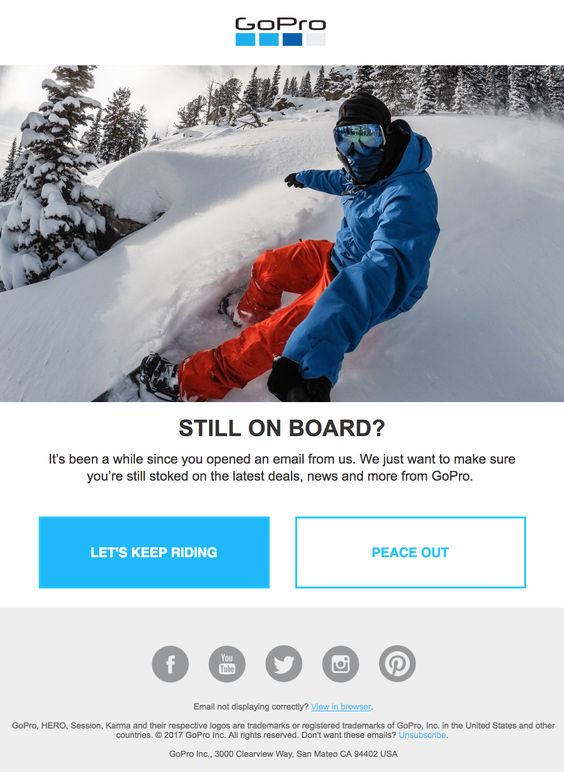
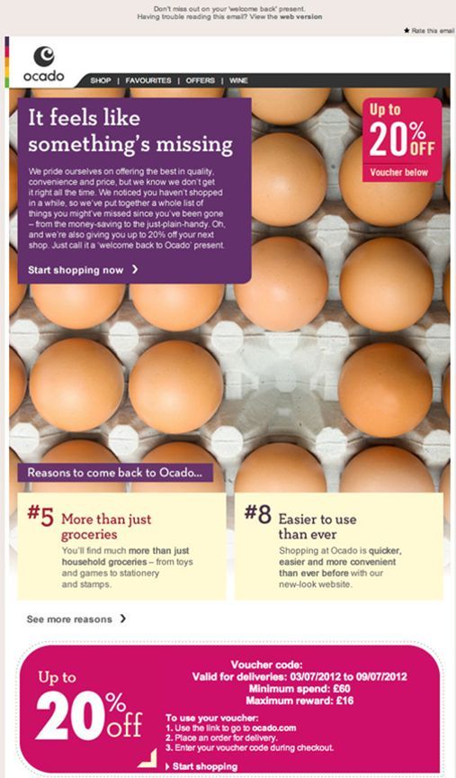
Unfortunately, not all of your subscribers will engage with the emails you send them. The average office worker receives 121 emails a day, making inboxes a competitive environment for you to be seen. A couple of reasons why some people might not engage or open your emails include; content, frequency/time of sends and your subject lines. A study by Marketing Sherpa found that personalising the subject line can increase open rates by over 17%.


So here are 6 simple ways to try and re-active your less engaged subscribers and stand out from the other 120 emails!


1. Make your emails more relevant

One of the most obvious ways to re-engage your less active contacts is to go back to the basics, remember why your contacts originally subscribed to your mailing list and the communications they would expect to receive from you. Sending irrelevant content which the contact did not originally subscribe to receive could result in contacts unsubscribing or not opening your emails.

2. Define inactive

How would you define your less engaged users? Have a think about who would be classed as your less engaged contacts. For example anyone who has not responded, opened, clicked or acted on any email sent in the past 6-12 months. With this information you can then set up a list of contacts classified as less engaged and target these people with relevant re-engagement campaigns.

Inactivity can be classed differently depending on the industry you are in, for example if you’re running a transactional email campaign based on insurance renewal dates, you may expect less people to interact on a day to day basis, but when approaching the dates relevant to the contact they will be more engaged. This is where personalisation is key, making your campaigns specific and relevant to the data you hold on your contacts. If you work in fashion, you might want to look at seasonal trends to determine inactivity.


There’s a really great school of thoughts around the key ways of defining active / inactive subscribers which split into three:

  • Ghosts: (they were never active, just joined your list once and never opened anything.  The best way to target these people is with a re commitment campaign (e.g. are you still interested) if they’re not, get rid of them!

  • Un-engaged (sleepy) – they were once engaged but aren’t any more AND it’s only just happened.  Best way to target these people is with a re-engagement campaign.


  • Zombies – They were once engaged but haven’t interacted with an email in yonks and it’s unlikely they ever will (Zombies may have once been the un-engaged).  Best way to target these people is to ramp down communications slowly e.g. if you were emailing them weekly, go down to monthly, if you were emailing monthly go down to quarterly etc

3. Target relevant people

Now you have got your less engaged users defined, you can split them into different groups to ensure they are getting content which is relevant to them. For example you could look at your contacts age, geography, buying behaviour, job title, education or previous open activity. With this information you can go back to point 1 and target these contacts with relevant content based on their demographics.


4. Find out what your contacts want…

…and make sure you’re giving it to them. You can use surveys, polls and forms to find out more information about what content your less-engaged customers would like to receive from you. You could ask them questions about the emails they have received from you in the past and what content they would like to see in the future.

Now would also be a good time to ask your contacts to update their marketing preferences. Ask them how frequently they would like to receive emails and what content they would like to recieve, for example; marketing material, business updates and newsletters.

The key thing here is making sure that you use any learnings you find from asking to influence your strategy going forward.


5. Include CTA’s

It’s important to include call to actions in all of your marketing emails you send out. Giving your contacts the option to get further information and learn more about the content you are sharing with them is vital. Building a reputation that your emails are going to contain exciting, relevant content will increase the chances of your contacts engaging in future communications. Make sure you’re getting the most out of your CTA’s by checking out our blog on Call to Actions!


6. Improve your subject lines

Subject lines are really important and will most likely be one of the main deciders to someone wanting to open your email or not. There are many ways you could improve your subject lines. We already have a really handy blog post with our Top Tips for an Irresistible Subject Line, go check it out.


I hope these 6 tips have given you some ideas to try and re-engage with your less active contacts. Using our email platform, Enabler, you can build great re-engagement emails, forms/surveys and polls and organise your contacts into data lists. If you would like any assistance or if you have any questions, please contact us and we will be happy to help!

Sometimes marketers need to learn when it’s time to let go. There’s nothing wrong with cleansing your data of people who don’t want to hear from you. Inactive subscribers can be a waste of time and resources. What’s the point of focusing efforts on a contact that doesn’t seem interested in your company or product anymore?

A final point to consider, if you are constantly trying to email people who aren’t opening your emails it could have a negative effect on your sending reputation/deliverability. For example if Google or Yahoo sees that you’re sending email after email to people that aren’t opening them, they could start diverting your emails to the spam folder.

It’s all about making smart decisions summarise what you’ve said and wrap up

Half the battle of any email campaign is managing to grab your audience’s attention with engaging content, the other half is making sure you convert that attentive audience into interacting with your content. Even with high open rates, this doesn’t necessarily mean you are really engaging with your audience. It is quite common to see low conversion rates when emails aren’t centred around getting the customer to focus their attention towards a particular call to action.

Every day we receive a number of emails in our inboxes covering a wide range of subjects, from informative updates to newsletters we may have signed up for in the past. But what sparks that first half of engagement makes us want to open the email instead of just swiping left and deleting it?

Placement

We all know a catchy subject line works wonders for increasing call to action activity.  Once we get the audience reading the content of the email, the next half of the battle begins, and the emails that always seem to prompt us to actively engage with them are those which appeal to our interests.  In general, if you want your call to action (CTA) to catch the reader’s eye and drive active engagement, you need to give careful thought to the CTA’s placement within the email and and the precise language you use to grab that attention.  Effective calls to action are based around good design and good use of text which indicates a reward for clicking, at the end of the day there’s a reason they are called ‘calls to action’, so be sure to use text that encourages readers to take action and include strong visuals with a sense of immediacy.

A great example of CTAs being put to good use is when artists release new music online.  In this day and age, success is (sadly) determined by how many listens an artist’s song can accumulate, as opposed to actual record sales.  Emails promoting new music releases are a great example of CTAs that have a clear immediacy which rewards the reader for clicking, providing the reader with an abundance of opportunities to listen to the track straight away from within the email.

Phrases like ‘click here’ provide no real reward for clicking, as they do not provide the reader with any incentive for clicking or an indication of what they will see once they do click ‘here’. The best CTAs utilise text relating to what you are offering as they provide a more attractive incentive to the reader, which in turn is more beneficial to your marketing campaign.  The example below is a simple but effective CTA used by Chipotle from one of their recent campaigns.  The term ‘claim now’ instantly gives the reader the impression they will receive something by clicking (in this instance, a free burrito), which helps achieve the marketing goal by driving click throughs and ultimately ensuring retention.  (Just as a side note, depending on the styling of your email we would recommend not centre aligning your text as it is less accessible and can sometimes be harder to read).

Be aware about the positioning of the call to action within your email template. The main aim of including a call to action is to get people to click on it, so for example by placing it near the bottom of a long email will not do you any favours. Ideally, you want it to be in a prominent place so it is recommended to keep it above the fold of the email, this should ensure nobody ever misses the CTA and it gives the reader the opportunity to know fairly soon what they will get as a result of opening the email.

Styling

Consideration can also be given to focusing text around the first person, for example changing ‘your’ to ‘my’.  Of course this all depends what the subject is, but through simple A/B testing you will be able to see which works best for you.  Our in house email software, Enabler, gives you the option to split send to your database, which is a great way to see how a particular set of customers react differently to others. Discover how A/B testing can help you achieve more from your campaigns here.

One important thing to remember is that a call to action is not just a meaningless small button tucked away at the end of an email.  In order for it to be effective, the call to action needs to be relevant to the content of your email, and on some occasions the subject line.

If more than one call to action is required in the email, then you need to add variety to your CTAs by avoiding using the same one throughout. Different calls to action will trigger different emotions for people, so by adding multiple and varied CTAs which ultimately have the same goal increases the chances of getting that message across to the reader and encourages them to click.

These screen grabs from a recent Dr Martens email include different CTAs showing the reader the variety of products currently on offer, while also relating with the email subject line ‘Most Wanted Docs’ and overall message.

If your email requires more than one call to action to be included, decide which is the most important and make it stand out more than the others. This will not only ensure your promotion stands out, but also give the customer the option to choose another route if they so wish.

It can be beneficial to leave plenty of white space around calls to action – a recent study by UX found user activity increased by 20% in email that incorporated white space into their templates (and around CTAs). Due to the CTAs impact as a result of the white space, other components such as images and font colours stand out better. Sometimes less is more and in this instance having some form of white space goes a long way to getting the customer to view your products and/or services.

Creative

Calls to action do not necessarily need to be limited to just text. Over the past few years we have seen an increase in the usage of imagery and animation not only in email but in most forms of digital communication – anything from a meme to a GIF. With regards to GIFs, including them can definitely help towards a larger conversion rate. They add an extra element to the overall look and feel of your template designs by providing a much more visual (and in some cases literal) portrayal of your content.  GIFs allow you to tell more of a story and have a clearer message that takes away some of the (mis)interpretation text-only emails may cause.  Having a more visual CTA could be the advantage you are looking for to get ahead of your competitors.  Here’s examples of good GIF usage:


Overall, a good call to action within an email is one which grabs the users interest and encourages them to click through. They are an integral addition to any template especially when the objective is for example to promote a product or event, placing importance on the design, placement and integration of a CTA will help you get much more from your email campaigns.

Plug in, crank the dial and listen up, as we take a look at the power of Google’s new AMP for Email.

AMP (Accelerated Mobile Pages) launched in 2015 by Google was developed as an open source framework to speed up mobile web, to cut out or bipass all of the code that slows down page load and performance, and supply faster, smaller alternatives to the code, mainly via JavaScript.

As of February 2018 AMP is available for email, under the catchy (if unimaginative) title “AMP for Email”.  According to Google, this is so “developers can create more engaging, interactive, and actionable email experiences.” It will allow the user to submit forms or surveys, check flight details, change a booking, get the latest news or search, select and purchase an item without even leaving the email. Basically Google doesn’t want you to leave the inbox if it’s not necessary, reducing the user journey from A to B.

Divided we fall

However, AMP for Email has caused a divide, with the majority wanting to pull the plug entirely.  AMP for Email brings new opportunities for marketers, offering their clients interactivity, increased performance, and improved email accessibility. Which sounds great, but ‘wiring’ your emails for AMP is not that straightforward.

There are initial concerns around security, as Google’s AMP for Email requires the injection of JavaScript to run those carousels and shopping baskets, and the use of third party integration could potentially raise unforeseen vulnerabilities.

Another concern is that Google just wants more control over people’s data, deciding how a process should work regardless of any current, tested, custom version. Imagine a retail store has developed its shopping cart process best to suit it’s clients needs, AMP for Email will not necessarily use this same process. What kind of impact does that have? Will the client lose faith with 2 processes? Will the website suffer from lack of driven hits and missed sale opportunities?

Lastly, when Google mentions interactive and dynamic content within email, are they possibly talking about Google Ads?  It’s very likely that Google will use this opportunity to push their Google Ads through AMP for Email. Hopefully we won’t end up with emails resembling bad 90’s style websites.

We also have to consider if AMP for Email is even necessary? Is this a revolutionary kick start to interactive email or is it over complicating what is meant to be a simple process.

“It’s like someone who sells bottled water telling you your tap runs too slow.”
– Devin Coldewey

The Light Show

Let’s have a look at some of the code, here is a basic layout for an AMP Email:

Doctype required declaring the html to be ⚡4email (“ampforemail” also accepted)
<!doctype html>
<html ⚡4email>
<head>
<meta charset="utf-8">
<style amp4email-boilerplate>body{visibility:hidden}</style>
<script async src="https://cdn.ampproject.org/v0.js"></script>
<style amp-custom>
.emailbody {
padding: 16px;
}
.helloworld {
font-family: sans-serif;
color: red;
font-size: 24px;
padding-bottom: 8px;
}
.images {
max-width: 100%;
}
</style>
All CSS to be included in <style amp-custom> tag, as above.

</head>
<body>
<div class=”emailbody”>
<div class=”helloworld”>
Hello, world.
</div>
<amp-img src=sample.jpg width=300 height=300></amp-img>
Components like the img tag above, adopt the amp name.
</div>
</body>
</html>

There are also a number of components that have changed:

 If you want to have a go, you can double check your code with an AMP HTML validator.

The Output

This is not the first time Google has pursued email interactive products.  In early 2010 they Beta tested “Enhanced Email”, “Google Wave” and “Google Grid”. All with not much success and were dropped after a few months.   Interactive email could be the new era, and even if AMP for Email is not the right step, at least it is a step toward the future advancements of email.

Are Google pushing the boundaries of the inbox, or just trying to take it over?
But then who better to trial these new concepts than Google, perhaps if Apple or Microsoft adopts AMP for Email we will see further developments and testing.


“All progress has resulted from people who took unpopular positions.”
– Adlai Stevenson

AMP for Email is in its early days, the full working version won’t be pushed out until later 2018, and there’s still a lot of unanswered questions regarding security. Some are excited, most seem to think it’s a bad idea. Lets just hope it’s a plus for the world of email.

For more detail on AMP for Email you can see a recording from the AMP conference 2018: A New Frontier for AMP. Or, if this has piqued your interest, hit me up on Twitter –@Dipper2009 #emailgeeks.

When it comes to emails, us marketers are always striving to get the most ‘bang for our buck’ from our email marketing software.  We can be very greedy, wanting the cheapest software, with the most features, that’s easy to use and can help us secure the most clicks.

Sometimes however, a marketer will go all out and purchase an email software with all the bells and whistles, but they end up never fully utilising the features to their full potential, meaning they pay a lot of bucks for very little bang.

Now, as a proud email software provider this makes us very sad.  We always ensure that our clients know every inch of our email system, Enabler, because we want our customers to fully utilise the system and all its features to help them create the best possible email marketing campaigns that generate the highest levels of engagement.

So with that in mind, let’s take a look at some of Enabler’s key features that can help you create slick email marketing campaigns, fast.


Five key things you might not have known you could do with Enabler:

1. Drag and Drop Templates

Enabler has a really simple, easy to use Drag and Drop email editor. This allows you to create beautifully responsive email templates effortlessly, without requiring any HTML or coding skills.

The Drag and Drop editor allows you to build your emails from a blank template or preset designs built by the creative team at Enabler.  You can effortlessly drag different components into your email to help create and enhance your email content, including text, images, buttons, social media widgets, video or even bespoke HTML code snippets.

All our Drag and Drop templates are fully mobile responsive, and can be edited and duplicated in a handful of clicks.

2. Forms, Surveys and Polls

Once you have created your email template using our Drag and Drop system, you might want to create a more comprehensive email campaign that enables you to gather additional information or feedback from your customers. Using Enabler, you can quickly and easily build forms, surveys and polls into your marketing campaigns.  These elements are all fully customisable, allowing you to change the colours and imagery to match your branding. Enabler gives you complete flexibility over how you display these forms, surveys and polls, enabling you to link to these elements from your email campaigns or choosing to embed them within your own webpages.

You have the flexibility to set up submission alerts notifying your campaign managers (or anyone you like) whenever someone submits an entry. Another intelligent feature allows you to set up ‘automated trigger emails’ to be sent off the back of a new form submission. This could be extremely useful if someone signs up for a newsletter or completes a form submission, as Enabler will automatically send them a confirmation / follow up email of your design.

Having such a smooth transition of automated communications between forms, surveys and polls, and your email campaigns, helps to make your marketing communications more efficient (saving you time), plus ensures a stronger likelihood of customer acquisition and/or retention.

Enabler gives you the flexibility to customise your forms, surveys and polls by choosing the format of your questions and adding as many questions as you like.  Another clever Enabler feature is survey branching, this enables you to direct the user down a different line of questioning depending on their answers.

You can find more information about branching and writing great survey questions in a recent Email Survey blog.

3. Extended Fields

Do you hold lots of unique data about your customers, for example birthdays, policy renewal/expiry dates, customer account logins, registration numbers, discount codes and location?  If so, Enabler enables you to not only store but also utilise this unique data by adding it into your email templates as extended fields.

Extended fields are variable fields that can be used within any Enabler template, pulling unique data through based on individual contact details. You can set these fields to contain whatever data you like (providing you have permission).

Here is an example of where one of our clients have used extended fields to pull in unique information about a customer’s policy:

Extended fields make your emails more personal by giving the contact receiving the email information that’s specific to them. This is really helpful when sending more bespoke, personalised emails.

4. Dynamic Content

Using the data you hold on your contacts, Enabler provides the functionality to display ‘conditional content’, where different content is displayed to different contacts based on their data, all within a single email template. Conditional or Dynamic Content can be as simple as displaying different content based on a contact’s gender, or it can have a far more powerful purposes for your marketing campaigns.  For instance, if a contact was looking at a particular product on your site and that information was contained within your data, you could display that product within your email template. Another example could be displaying different information based on a location or postcode, or if they are a new or existing customer.

Providing you have the data, you can set up as many conditions as you like based on any of the data you hold. With every condition you set up, it has to be met by a particular contact(s) in order to display content.

The screenshot below shows an example of a condition where contacts who have an extended field, “Favourite drink” that contains “Espresso”, Enabler will insert an image of an Espresso.

5. Reporting

We all know that sending an email campaign is only one half of the process. After your email campaign has been sent,  you then need to do the all important reporting. Many of you who already use Enabler will know of our ‘Dashboard Report’, which gives a clear overview of all your standard email stats, including open rates; CTR, unsubscribes, bounces etc.

What you might not know is that Enabler has a whole suite of Management Information Reports which provide in-depth analysis into the results of your email campaigns, giving you extensive insights into both your how your campaign performed and a greater insight into your contacts.  Enabler’s reports include Browser Analysis, Click-Thru Times & Frequency, Demographics, GDPR Reports on customers, Campaign Charts and many more.

Enabler’s comprehensive reports have been designed to give our customers a greater understanding of their campaign performance and their customer behaviour, which in turn help to inform future email campaigns.  By providing powerful reporting tools at your fingertips, we ensure our Enabler users have the information they need to really make an impact with their email marketing campaigns.

Hopefully this has given you some inspiration to use some of Enabler’s features on your upcoming campaigns. If you have any questions about Enabler and its features please contact our email team who will be happy to assist you.

Do you want to learn more about your audience and enhance the quality of your data? Surveys are a great tool to gather valuable insights and information, allowing you to collect enriched data in both a formal and informal fashion.. Capturing data from your customers allows you to really personalise your email campaigns, allowing you to  target your customers with more relevant marketing content. Ultimately,  this should improve your overall open rates and engagement level.

But beware, when it comes to email surveys there are some common mistakes that are easy to make…


Here are seven helpful pointers that will help you on your way to pulling off a great email survey.

1. Write Concise Questions To Get Accurate Answers

Make your questions easy to understand by being to the point and use simple, everyday language.  The goal is to ensure your readers provide you with clear, accurate answers, so write short, simple questions and keep your tone informal without cramming too many things into one question.

Here’s an example of a badly worded survey question:

“How would you rate the delivery time and packaging of your recent order?”

This is an example of a double-barrelled question.  By asking the customer to answer about both the delivery time and the packaging,  you can end up confusing the customer and forcing them to answer two questions in one.  This could lead to the customer answering inaccurately to one part of the question or not answering the question properly at all.

In this instance, we would split the question into two, for example;

“How would you rate the delivery time of your recent order?”
“How would you rate the packaging of your recent order?”

Options: Excellent | Good | Fair | Poor

Making your questions concise and to the point will give you the best response rate as it makes it easier for the customer to complete the survey accurately.

2. Use Words With Clear Meanings

Try to avoid using words and phrases which could be left to the user’s interpretation (or misinterpretation). You want to include phrases and words which are commonly understood.
For example words like numerous and several are too vague in their meaning and open to interpretation. You want to use words that are more commonly understood and provide more accurate information, such as almost all, a majority of or almost none provide customers with a more accurate, clear interpretation of the questions meaning.

Using common and simple phrases will ensure your customers can easily answer the questions without having to think too hard about the answer they are selecting.

3. Offer An “Out” for Questions That Don’t Apply

Unfortunately, not everyone will be able to or want to answer every question. Give the reader an ‘out’ option. This will minimise the chance of people leaving the survey before completing it. It will also remove the chances of getting incorrect data. However, if you’re certain the reader can answer every question you do not need to do this.

4. Expand On Your Answers

Where you can, change your ‘Yes/No’ and multiple choice questions to interval questions. Make a statement, and ask people to answer it on a 1-5 or, ‘Strongly Disagree, Disagree, Neither Agree nor Disagree, Agree, or Strongly Agree’. This will improve the quality of your results massively and give you more accurate information in return.

5. Make Sure Your Survey Works Across Devices

Almost everyone has multiple devices, mobile phones, tablets and laptops. Make sure your survey is compatible across all devices to ensure it’s easy to access for everyone.

6. Personalise Questions Based on Customer Responses

Using a process called “Branching” you can personalise your survey to guide customers into following a more suitable line of questions based on their previous answers. This allows you to capture more relevant/personalised data.

For example, you could ask the customer “How many children do you have?”. Depending on this response you could then direct the customer down a different line of questions. For instance if the customer has children, you could go onto ask parenting questions, if they don’t have children you could ask for the customers opinion on families and parenting.

Using branching allows you to receive more relevant information about your customers and again allowing you to send more personalised and relevant content to them allows for more accurate answers.

7. A Final Tip Before You Begin

Pre-testing will help identify unclear questions or badly-worded responses before you send your survey out to your readers, giving you a chance to improve your survey and its chances of generating accurate, actionable feedback.

Hopefully these tips will help you create a fantastic survey with great results! Using our system, Enabler, you can create integrated marketing campaigns, and use tools such as surveys to enhance your campaigns and strategy.

Email marketing has been and will continue to be one of the most effective marketing tools in a marketeers arsenal. On the face of it, email can look really straightforward, but underneath there are intricacies that make planning a successful email strategy tricky… especially for a first time flier! Given the complicated nature of the email channel, we often get asked if it’s actually worth using the channel at all. As you can imagine, my answer is yes… and here’s five key reasons why.

1 . King of All Marketing Channels

Email marketing works 40 times better at acquiring new customers than Facebook and Twitter, and compared to social media; offering marketeers 17% higher conversion rates.

That’s right. Email rules the roost. Now, I’m not saying you should read this and immediately go and start bombarding your marketing list with emails, but this definitely demonstrates why you should be making efficient use of the channel. Additionally, email is better than Facebook because according to Forrester, people are twice as likely to sign up for your email list as they are to interact with you on Facebook.

2 . Subject Line Influence

47% of people will open an email based on the subject line alone.

Now I was pretty astounded when I found this figure out. In my head, as a marketeer, people would primarily be opening emails based on brand recognition, so to find out subject lines actually have a pretty huge impact, without the branding side playing a role, changed the way I approached my email marketing. What’s really interesting is that 69% of email recipients report email as spam based solely on the subject line, so it’s a careful balancing act.

If you need some help creating magical subject lines, check out our top tips for an irresistible subject line.

3 . Impact on ROI

44% of email recipients made at least one purchase last year based on a promotional email.

If this doesn’t convince you how valuable the email channel is, I might as well give up now! This is why we try and grow marketing lists and target people using personalisation – the benefits it can have are incredible.

I don’t know about you, but in every place I’ve worked, email is the one thing that is constantly questioned. I’ve lost count of the times where I’ve heard ‘Yeah but does it actually do anything’ or ‘Prove it’. This is a clear sign that email is a valuable channel and incredibly effective.

4 . Checking in

89% of Americans check email at least once a day; nearly 21% check their email more than 5 times a day. This is a true testament to how many opportunities there are to not only drive existing and potential customers to buy from brands based on email, but also to increase brand awareness and presence. There is no other marketing function that allows you quite as much exposure to consumers so efficiently.

5 . Useage

According to Radicati’s 2016 Email Statistics report, emails will be used by 3 billion people by 2020. That’s almost half of the world’s population.

Currently, there are over 2.6 billion email users worldwide. This is crazy given how many other forms of communication are available e.g. IM, Social Media. While new communication tools are constantly being developed and released, email is the one outlasting them all. You will also find that email addresses are the main form of identify required for day to day functions such as online shopping and social networks, suggesting that no matter how many new ways of communicating spring up, email will always be necessary and useful.


So there you have it – five key stats about email.

Choosing the right email provider can feel a tad daunting. The closest thing I can compare it to is renting a house. You really want to find somewhere that fits all your stuff, has all the rooms you need, doesn’t cost an arm and a leg to rent, and you wont end up wanting to move a few months after signing the contract. Sure, you can deal with having no double glazing… but why should you? It’s the same with email providers. You want one that stores all your stuff (data) in the way you want it to, has all the rooms (functionality) you need, doesn’t cost an arm and a leg to use, and ideally you don’t want the hassle of having to switch providers down the line because it doesn’t live up to expectations.

Don’t panic though, because I’m going help make choosing a new email provider very straightforward and, unlike house viewings, you won’t have to leave the comfort of your chair!


Six Easy Steps to Follow When Choosing an Email Provider:


1. Strategise

You’re clearly looking for an email service provide (ESP) for a reason. My guess is you’ve worked out that email is a super effective marketing channel, where the costs can be relatively low and the results can be outstanding. But before you choose your provider, you need to think about how you want email marketing to work within your overall marketing strategy.

It really is important to have clear objectives and goals around what you want to achieve from your email marketing. These decisions will help influence your choice of provider, dependent on if they offer the functionality to help you achieve these goals.

For example, are you going to be sending newsletters, upselling or using email as a lead gen tool? What metrics do you want to track?  Do you want your emails to be created within a simple drag’n’drop system or do you want to add externally created HTML designs? Are you interested in dynamic content or A/B testing? Your answers to all these questions will help dictate the features you want from an ESP. It will also give you a clear idea of what your priorities are when selecting an ESP, and who is most suited to facilitate those priorities.

2. Think About Features

There are four key features that you should be checking when selecting a provider – and they are a must. You’ll need to ensure that the tool you’re looking at not only has those features, but also makes them easy to use. You’ll also need to have a clear idea about which features are a priority to you and your business.

Templates:

A key part of any email campaign is creating the emails you plan on sending. Any decent email provider should be offering you an easy-to-use solution for creating the email templates yourself within their system. For example, in Enabler, we have a drag and drop system which allows you to create emails using simple building blocks, that are mobile responsive by default (another key thing to look out for). When looking for your new system, you should also want to ensure it allows you to upload HTML and images created externally to the tool. Free image hosting is a great bonus too!

Tracking:
Automation:

Sending the most relevant messages to the right people at the right time is super important, and that’s what automation helps you do. Ensure your email service provider offers solid workflows to help you schedule and send automated messages.These should be laid out in a clear way – a step-by-step structure usually works really well. If you feel like you need more information about automation before making a decision about what works for you, take a look at our blog: What is Marketing Automation?

Extras:

Is there something else that you think you might need for make your email strategy to work? Maybe you want to be able to create and send forms and surveys, or create bespoke landing pages from within the tool? Really good ESP’s will provide these things, some even provide them as standard – like Enabler -, but not all will so make a list of what you need and make sure to ask each ESP if they fulfil these requirements.  It’s also worth asking if these features come with the system or if they are optional extras that you will be charged extra for.

3. Define Your Budget

Email in general doesn’t need a huge budget to be effective, but in marketing, effective isn’t always enough. If you want truly epic campaigns and associated analytics, you need to ensure you’re putting the budget in place to achieve this.

Email systems vary in terms of price range. There are very basic free tools out there and then there are tools that cost tens of thousands of pounds and have a ton of advanced functionality.

Now, enterprise level providers may seem attractive on the surface, but if you don’t actually use all those fancy add on features which cost those extra pennies (which by the way can take a lot of time to learn how to use in the first place and you may end up spending many precious hours trying to navigate) you’ll end up just throwing good money away.

Basically, you have your choice of low, medium and enterprise level providers. Choosing the right one for your needs can keep costs low and deliver functionality while simultaneously keeping return on your efforts high.

4. Look at Delivery Rates

There’s no point putting together beautiful campaigns if they don’t get through to anyone. To have a chance of engaging customers and prospects, your messages have got to land in their inboxes. Now, that might sound obvious, but not all ESPs are equal when it comes to delivery rates. Make sure you are asking potential ESPs about its delivery rate and how they work with their customers to keep that rate high. Ideally you want to be searching for a provider that can offer rates of over 95%.

To bare in mind that delivery rates are a combination of both how the email service provider ensures delivery to inboxes on the backend and how you use the service. For example, if you buy a data list and start sending to it, you may find that you have a high bounce rate which can impact your sending reputation. Ensure you are asking for any resources they offer on best practices for content and list management, and also find out if you can have your own sending IP to ensure you’re not influenced by what other clients of the ESP are doing with their data.

5. Check Out Customer Service

ESPs will all offer different levels of customer support for their product. There are a few key things to look for in this area when selecting a provider:

Support response:

Give their support desk a call and see how long it takes for you to be speaking to a real human. Is there a key place on the product that tells you how to get in touch with the support desk? Have a look at what their response rates are – they should be able to share these stats with you (example of one of these stats guides from Enabler’s customer service desk to the right). Think about what kind of support you will need, do you need Monday to Friday, or weekend support, or particular international timezones? Have they ever won any email awards for their product or support?

Help systems / guides:

Does the ESP have an online help system where you can search through frequently asked questions, or find out how a certain piece of functionality works? If so, this a great sign. Properly good support systems will also have step-by-step how to guides available for key areas of the system.

What other clients say:

With any product, you want to know that you’ll get the best support out there. Testimonials from existing clients of the ESP are a good indicator of how good both the product and the support network is. You can also have a look at the sorts of clients using the product – do you think their objectives are similar to yours? If so, they may have done some of your homework for you!

6. Make an Informed Decision

Once you’ve considered all the factors we’ve discussed, you’ll be in a position to select a provider. Now, before you go any further, I wouldn’t be doing my job if I didn’t tell you to consider throwing Enabler into the mix (check out the product here). Right, sales pitch over. Time for me to wish you good luck in choosing your ESP… that’s if you haven’t chosen Enabler already! Okay now I’m really done, promise.

If you’re interested in finding out more about anything in this blog, drop me an email – I’m always up for a chat about email! #EmailGeek